How To Choose The Right Colours For Your Space
When you’re choosing colours for your home it can feel like a total mind field! Colour choice is absolutely one of the most important styling choices you are faced with when styling your home. From paint colour to fabrics and furnishings, colour has a huge impact on how your home looks and feels. So how do you choose the right colours for your space?!

A never fail strategy is limiting your colour palette to just three colours. Think about how certain colours make you feel, about what the space is used for and definitely don't ignore what YOU like and dislike! If you’re leaning toward a monochromatic colour scheme then use variations in tones and tints with the one colour, creating interest through texture. Cool colours lend themselves to sleep and relaxation and warm colours are more energizing, so if you’re an early bird, lighter colours work best for the bedroom, whilst if you’re a night owl you can opt for darker hues in the bedroom. I’m going to talk about bedrooms because let’s face it, unless you suffer from clinophobia (fear of beds) you’ll spend more time in your bedroom than any other room, it’s the first and last room you see everyday.

A La Naturale
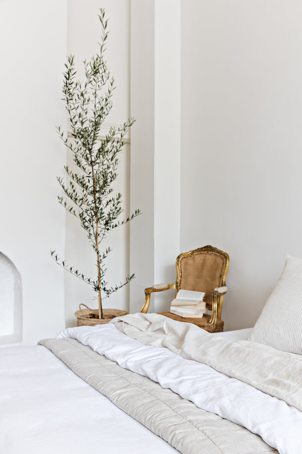
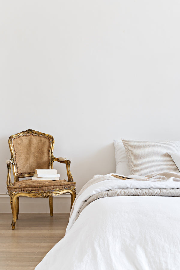
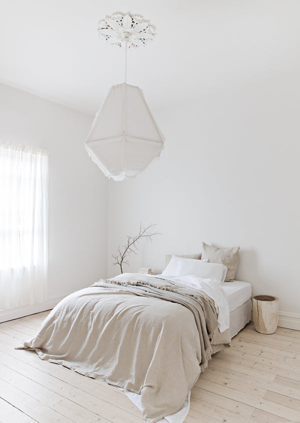
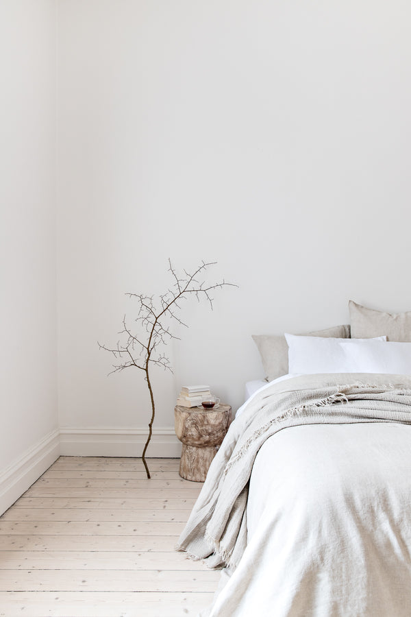
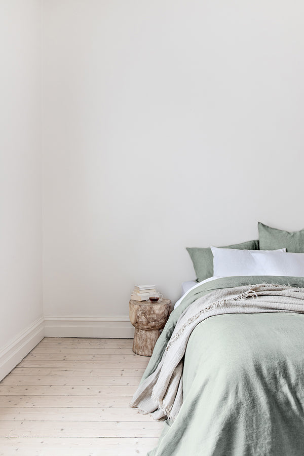
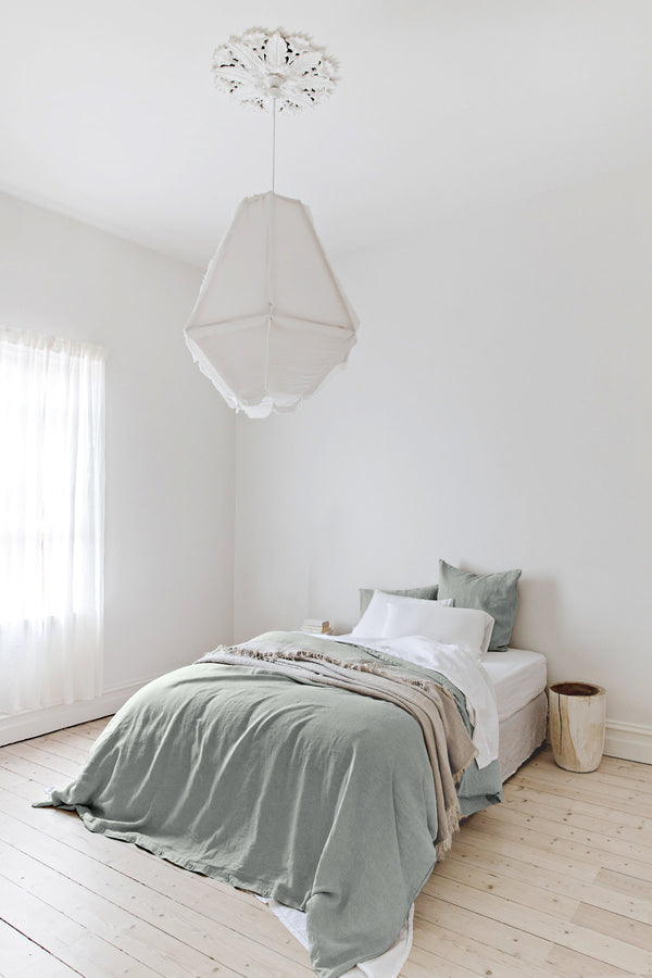
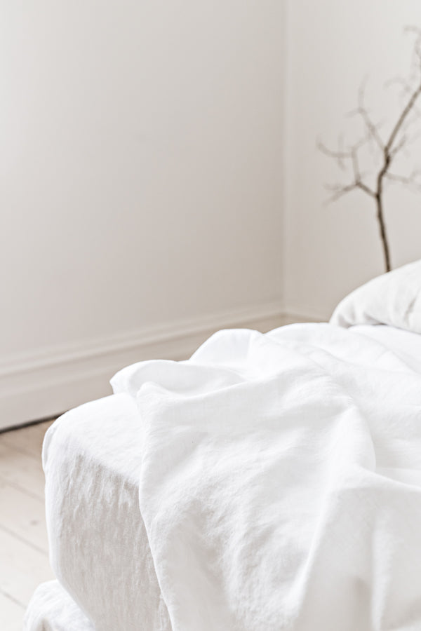
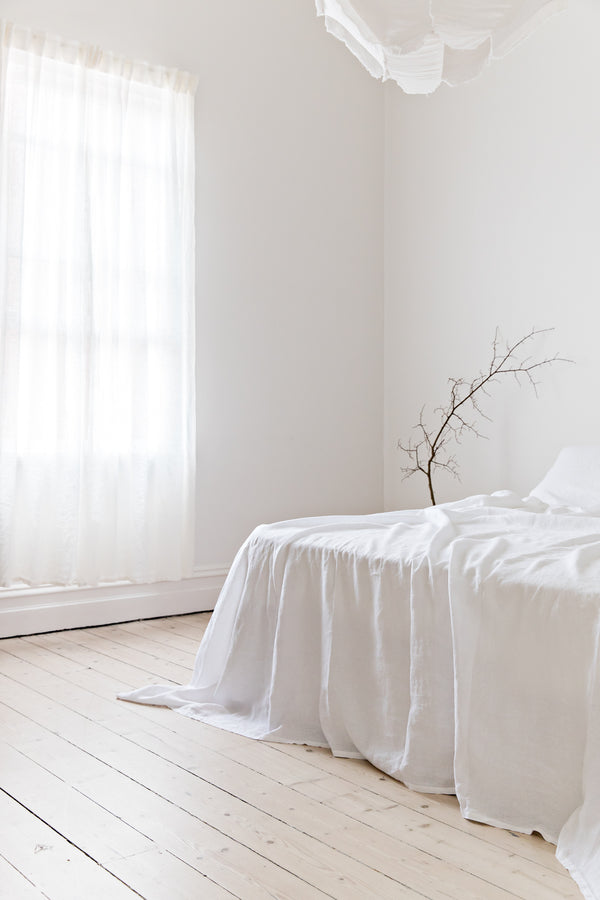
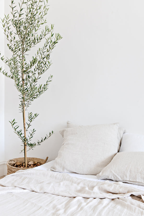
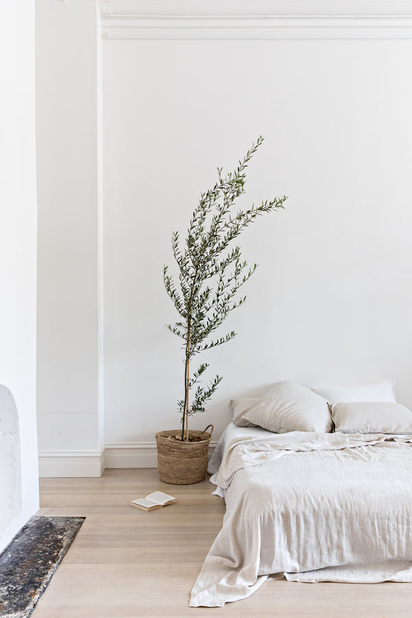
By far the most popular choice for bedroom styling is a neutral palette (and I am ALL for it!) A neutral colour palette achieves a relaxed, peaceful environment, exactly what I look for in a bedroom! Texture is especially important if you’re keeping the colour palette neutral (which is why I LOVE linen) and incorporating furniture in natural materials. Don't get too obsessed with whether or not all your materials are exactly the same colours, work in tones. I love similar light timbers together with rattan, which give a space a natural look without everything being too matchy-matchy. Stick to a light neutral colour palette for your bedding, try shades of white, cream or stone. If you’re looking for a little more colour introducing green is the perfect balance to a neutral or all white theme. Olive matched with neutrals and organic textures enhances its earthiness. Olive green is super versatile and can also be used to break up stronger timbers and bolder colours, bringing everything back down to earth. And softer greens, like sage in a muted grey tone is perfect for a subtle hint of colour.


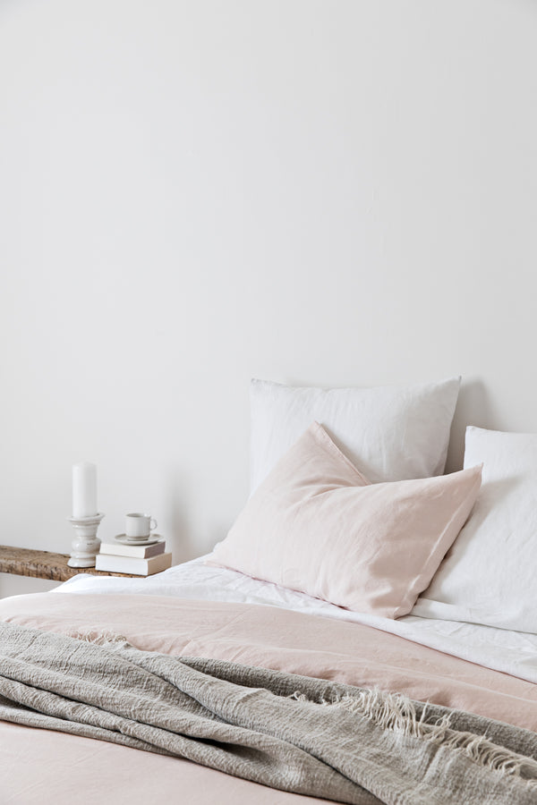
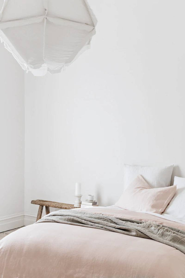
Sandy Toes
If you’re after a summery coastal vibe it doesn't mean your entire house has to be coastal blue tones, go with soothing colours that make you feel relaxed; a base of muted tones like sandy neutrals and nude peach with furnishings all in raw natural materials. And don’t be afraid to inject a little bit of colour; rust works in with neutrals to create a nostalgic summer vibe. An updated coastal look with raw timber, rusty oranges and organic elements creates a laid back summer feel. Or opt for sandy tones with nude blush or muted peach hues for a more sophisticated beach abode. The lightest shades of green work in with a coastal look, think sand, sun bleached grass and evening summer skies.


Fifty Shades Of
If you’re all about contemporary, monochromatic style choose blacks, whites and bolder greys or charcoals. Grey is far too underrated if you ask me, its chameleon like quality means it can appear cool or warm and pairs beautifully with both monochromatic whites and blacks, as well as working with muted pastels. Going all white doesn’t have to be boring, texture is the name of the game, and working with whites in different hues is how to make it work. Opt for a few bolder pieces in blacks and greys, and I would choose to use materials like concrete, leather, metals and timber to really hit the nail on the monochromatic look.


Go Boho
For all the bohemian lovers, choosing warm earthy colours in rusty oranges and olive green hues is the way to go. Starting with a simple base colour, like a neutral base allows the colours, patterns and textures to work collaboratively in a carefree and relaxed way. There’s no real “rules” when it comes to boho, but I would pair rust and olive for a bold bohemian look, or rust and peach for a more boho-chic style. Boho allows you to use styles and colours that you might not think of conventionally together, but a bohemian colour palette absolutely gives that warm fuzzy feeling no matter the season.


In all honesty, colour is totally a personal choice and what one person see’s can be completely different to the next. It’s like art; people love a piece or hate it. You really have to think about how it makes you feel and the space you’re trying to create. When I think about The Cover Collective palette I am always thinking about how each piece will work together, how swapping out your quilt cover can refresh your room, or opting for a different flat sheet can completely change the feel of your room to welcome a new season. What colours would you like to see me release?
Images featuring The Cover Collective linen:
@casakhali
@juthamat_by_jem
@my.burleigh.reno
@thebearcubclub
@zephyr_and_stone